It’s no surprise that income inequality in America is on the rise. Eighty percent of Americans have seen their incomes stagnate or fall since 1979. Meanwhile, the top 1 percent of earners is taking in more than ever before. We’ve made numerous charts to illustrate these disparities. But what if you could actually see the split between the superwealthy and everyone else?
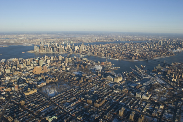
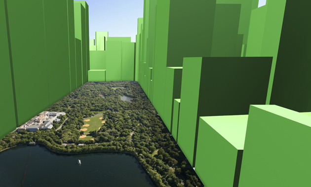
Artist and researcher Nickolay Lamm‘s images of income in New York do just that. Using 2012 data from the mapping site ArcGIS, Lamm superimposed 3-D bars over photos of the cityscape to show the median net worth of census block groups. For example, “if one section had a net worth of $500,000, the height of the 3-D bar shape for that section was 5 cm. If one section had a net worth of $112,000, the height for that section was 1.12 cm.” The resulting images clearly illustrate New York’s status as one of the cities with the highest levels of income inequality.
Below, you can interact with the cityscape and the 3-D images for various neighborhoods.


Central Park. The Upper West Side is on the left.


The Financial District and the southern tip of Manhattan. (Note: Statue of Liberty has been added.)


Harlem


Looking south over Manhattan from Englewood, New Jersey. Washington Heights is on the left. Central Park and Midtown are in the distance.


Midtown near the Trump Tower.


Above Brooklyn. The Financial District is on the left. Midtown is on the right.


Looking south toward the Upper West Side.


Above Central Park. The Upper East Side is on the left.


Above Yankee Stadium in the Bronx.


