Fight disinformation: Sign up for the free Mother Jones Daily newsletter and follow the news that matters.
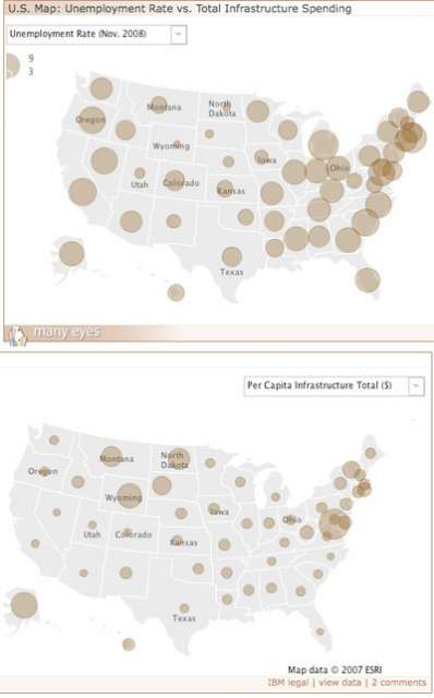
ProPublica used a neat data visualization tool called Many Eyes to create the two maps below, which I’ve chopped up a bit so I could fit them on our blog. The top map displays unemployment numbers by state. The bottom map shows stimulus funds by state. As Oregon, Wyoming, and a number of other states illustrate, there is essentially no connection. The amount of stimulus funds a state will get depends on a number of things, not least among them the seniority and committee assignments of that state’s representatives. Apparently “need” isn’t at the top of the list.