A version of this article was published on Source.
A few days ago, Abdul El-Sayed, an epidemiologist and the former executive director of the Detroit Health Department, told me that the last time the world was so fixated on one thing simultaneously was probably World War II. As the coronavirus has spread across the planet, many of us have become obsessed with understanding it through numbers—the number of cases in our neighborhoods, the number of hospital beds in our state, the number of people we’ve lost. All this data is good: I’ve written about how we’re getting an elementary lesson in statistical concepts by learning about “flattening the curve.” But all this data can be overwhelming: It’s hard to escape the stats, charts, and visualizations, and there’s no one-stop shop for reliable numbers. So here’s a list of some credible sources you can dig into to find the information you need:
Global data
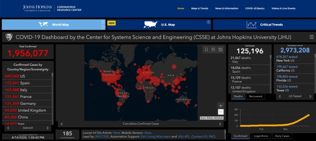
The best source for tracking the number of cases and deaths around the world is John Hopkins University. You may already have supplied one of the 1.2 billion daily interactions on its map of country-level data, collected from official government sources and updated daily.
(Mother Jones‘ Kevin Drum has been making informative daily charts based on the Hopkins data.)
The World Health Organization puts out detailed situation reports every day. If you don’t mind reading PDFs, they provide a wealth of information. (For example, the last three reports say no new country has reported coronavirus cases in the last day.)
For a quick glance, I also like to look at World-o-meter, which tracks active cases, recovered cases, and cumulative cases. Though World-o-meter is a popular website for COVID-19 data, there’s been some controversy about the accuracy of some of its numbers. So if I want to publish something, I’d cross-reference its data with Hopkins’ and the WHO’s.
Our World in Data also has an interactive dashboard that looks at different slices of official data.
US data
The COVID Tracking Project, a volunteer-run project that incubated at the Atlantic, provides some of the most comprehensive data on the number of tests conducted in the United States, based on information issued by states.
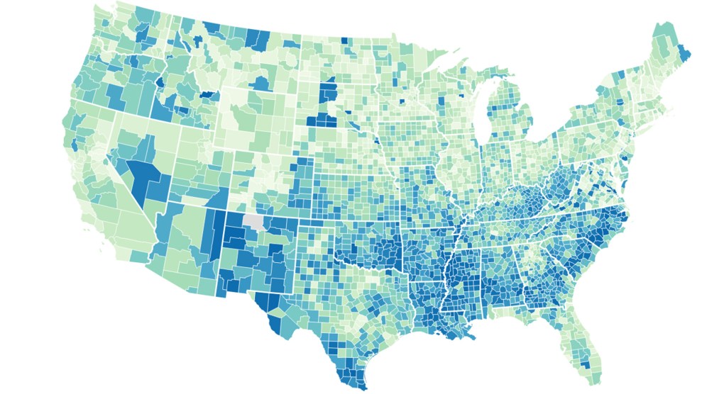
There are many other dashboards tapping into these sources. A notable one with a nice interface was developed by a high-school student. USAFacts.org has updated geocoded data on the number of cases broken down by county. The New York Times also has cases and deaths broken down by county level updated, on a daily basis. The city of New York has issued information on a zip code level.
Most of the data sources mentioned above are included on Big Local News, a platform from Stanford University run by data journalists and data scientists. Last week, they released an interactive map on of COVID-19 cases, deaths, and other information for every US county.
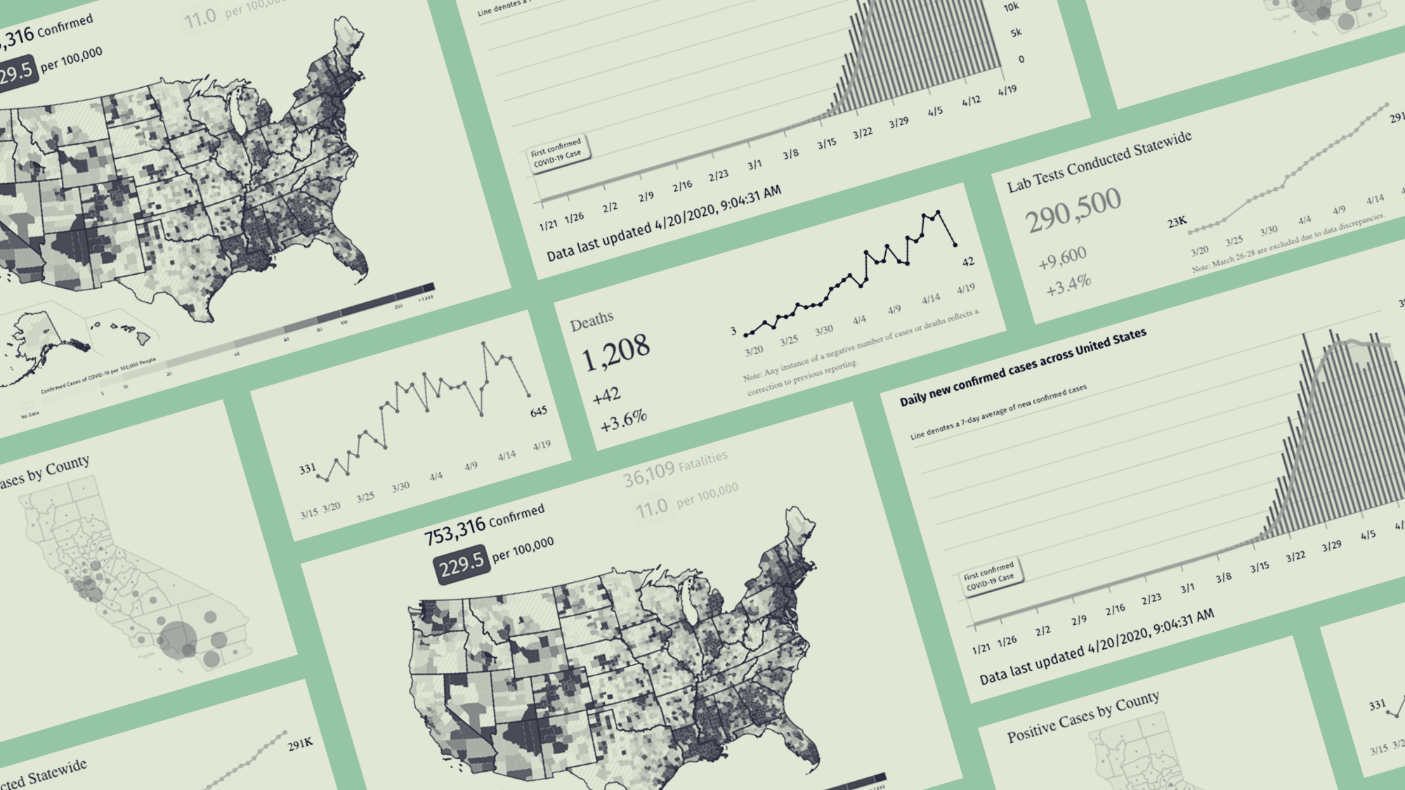
Salesforce’s collection of data visualizations on its interactive platform Tableau has charts that are easy to use and play with. Here are the most current stats in California, for example.
Projections
While statistical projections have helped officials plan accordingly (or not) for possible scenarios, they can also be scary and hard to read without proper context. During a global pandemic like this, there is much we don’t know, and projections can get things wrong. The Institute of Health Metrics and Evaluation has been issuing daily projections of when every state will run out of hospital beds for COVID-19 patients. ProPublica used data from the Harvard Global Health Institute to outline nine scenarios of how quickly hospital beds may fill up.
Policy data
Most states have been doing their part to implement social distancing policies. Researchers at the University of Washington have tracked when every state implemented different policies, from declaring states of emergency to closing schools. (I made this animation based on their data, which shows that Republican governors generally declared emergencies after Democratic governors did.)
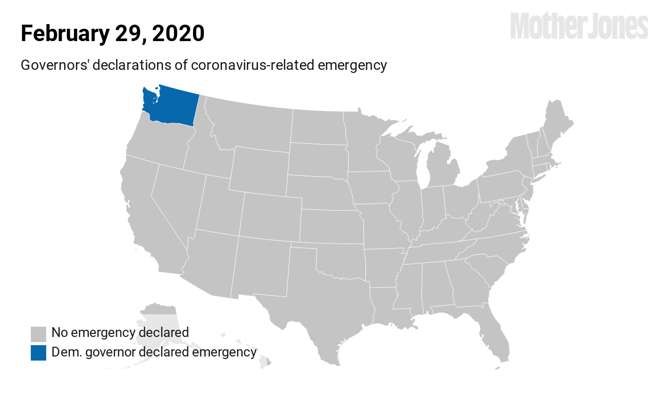 Source: University of Washington. Map: Mother Jones
The American Enterprise Institute also tracks and updates this data. The main source for tracking policy data is the National Governors Association, which keeps detailed notes on every state-level policy.
Data from private companies
COVID-19 has inspired some private companies to come out of the closet to share user location and tracking data that we suspected existed, but had not seen until now. Unicast, which tracks cell phone and location data to study movements of concertgoers, has made a dashboard that shows how people have been practicing social distancing (or not).
Tectonix, a similar company that offers location data analytics, mapped the movement of spring breakers in Florida.
Want to see the true potential impact of ignoring social distancing? Through a partnership with @xmodesocial, we analyzed secondary locations of anonymized mobile devices that were active at a single Ft. Lauderdale beach during spring break. This is where they went across the US: pic.twitter.com/3A3ePn9Vin
— Tectonix GEO (@TectonixGEO) March 25, 2020
Location data is rarely made available to the public, so it’s an interesting resource to explore. But there’s little known about how this data is collected or how it is vetted, so exercise caution while using it.
The current data landscape is rich and evolving, but the irony is that there’s still so much we don’t know about the pandemic: How does testing (or the lack of testing) affect case numbers? Why are some communities suffering more than others? Are some countries more resilient to the virus than others?
We know what we know so far, but there’s a lot more to learn from all this data once our lives return to normal, whenever that’ll be.