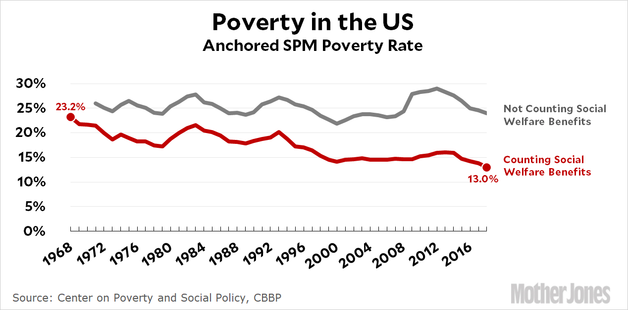
Sometimes raw data can point you in two different directions at once. Take poverty, for example. CBPP has the details here, but the basic story is that over the past half century we’ve spent a lot of money on social welfare benefits for the poor and it’s made a big difference:

Social welfare programs have cut the poverty rate nearly in half, and that’s true across the board. It’s true for children, for the elderly, and for the working-age population.
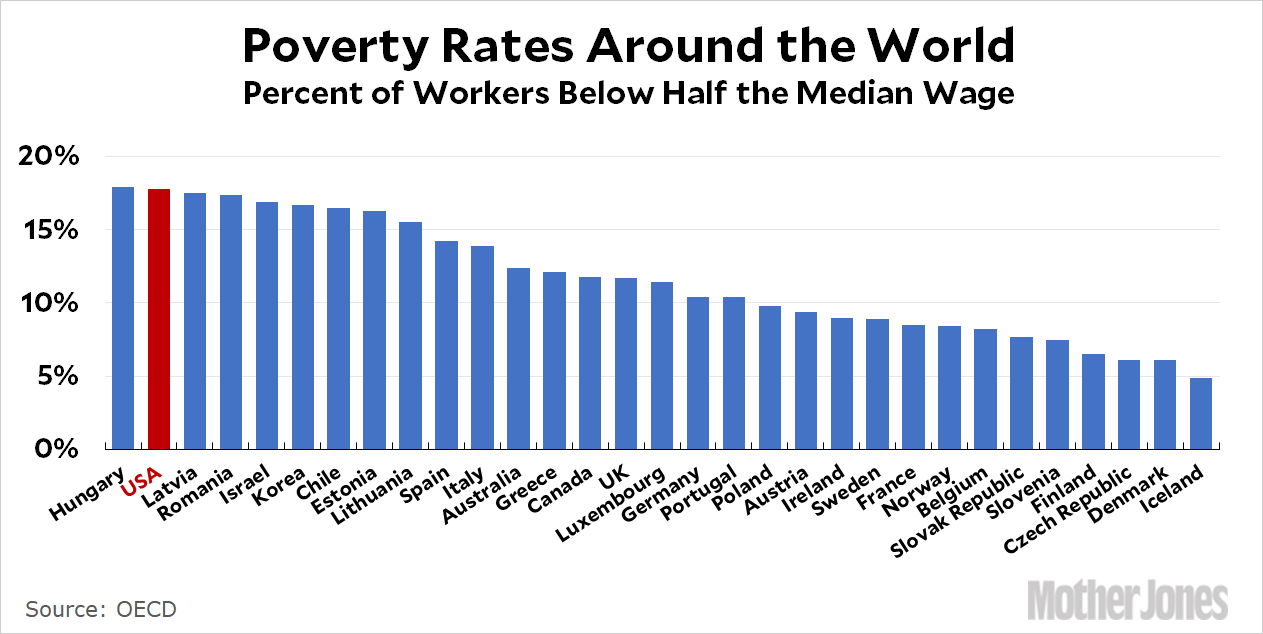
On the other hand, if you look at a consistent definition of poverty among our peer countries, things don’t look so good:

Both of these charts are true. There’s nothing sneaky about either one. But taken together, do they mean we’ve done pretty well addressing poverty? Or that we’ve done disgracefully badly? It’s your call.


