I get a lot of requests to please do my daily charts a wee bit differently or to add other countries or regions to them. I’m mostly not willing to do this since (a) I want the charts to be the same from day to day, and (b) adding more countries means it takes me a lot longer each night to create them. However, New York really does seem to be a pretty special case right now, so here’s a solo chart just for them:
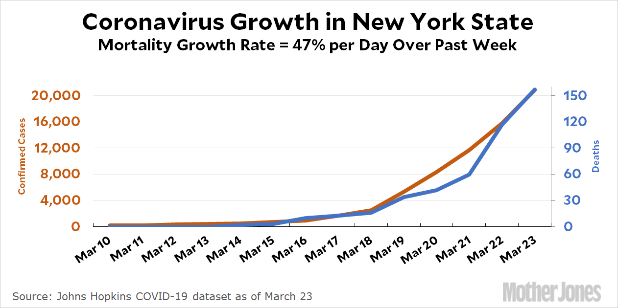
The number of coronavirus deaths has grown 47 percent per day over the past week and currently stands at 157. If this keeps up, New York’s death tally will surpass 2,000 a week from now and 30,000 within two weeks.
Of course, this growth rate might not keep up, either because a slowdown turns out to be the coronavirus’s natural behavior or because the control measures put in place are working. Italy’s death tally over the past two weeks, for example has been growing at 21 percent per day. If New York can get down to that rate, it will have about 2,000 deaths in two weeks instead of 30,000.
The growth rate really matters—far more than whatever the current number of deaths happens to be. That’s why this is what everyone is focused on.


