
Fight disinformation: Sign up for the free Mother Jones Daily newsletter and follow the news that matters.
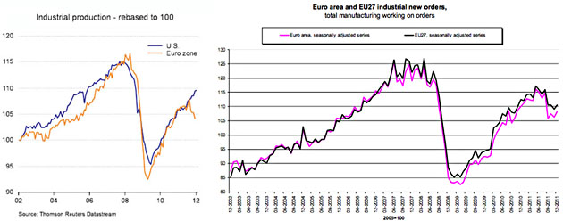
I just happened to see these two charts back-to-back this morning, so here they are in one spot. The first shows that industrial production in Europe is continuing a steep decline. The second shows that industrial orders have picked up a bit after a big fall in September. So which is more important? More informative? More predictive? Is Europe crashing or is Europe stabilizing a bit after a scary spell last year? Is the difference an artifact of a decline in exports? Exchange rate woes? Something else? As usual, it would be great if we just had another few months of data. It always is.