
A few weeks ago I wrote about a Nature article that suggested we were in the middle of a long-term decline in the volume of phytoplankton in the world’s oceans. I had a bit of email back-and-forth with Stuart Staniford about whether the results in the paper were really robust, but the upshot was unclear and the paper was, after all, in Nature, not some C-list journal. What’s more, the decline was pretty substantial. It was probably real.
But now comes another climate-related piece of research, this time in the equally respected Science, and this time Stuart’s skepticism is on much firmer ground. For the last decade scientists have been collecting information on terrestrial vegetation coverage using the Moderate Resolution Imaging Spectroradiometer (MODIS) on board NASA’s Terra satellite. Their conclusion: vegetation coverage is down, which means plants are pulling less carbon out of the air, which means we have yet another positive feedback loop causing an increase in atmospheric carbon levels.
The problem is that there are only ten annual data points so far, and they bounce around like a pogo stick. The trend over the past decade is slightly down, but the variance is so large that it’s almost imposssible to tell if this is just 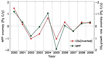 normal noise or a real decline. It’s still worthwhile information to share, except that the writeup in Science appears to go out of its way to avoid acknowledging the problem:
There is a whole long history in science of how to assess this kind of thing — to test whether a particular number or trend is statistically significant, as opposed to the situation where it could well just be a fluke. It’s a normal part of doing science that one analyzes the statistical significance of trends, and analyzes the likely range of uncertainty around a particular estimate. However, in this paper, there is no analysis in the paper of whether the reduction in NPP is statistically significant, and, as I noted, no error bar is provided for the “0.55 petagram” reduction.
So Stuart emails the authors, and they concede that their results aren’t yet robust (“Some research findings are so important that society really cannot afford to wait another 10+yr for 95% or 99% statistical confidence”). Stuart is unhappy:
Ok. So here we have a statistically non-robust result, that the authors are well aware is not statistically robust, being published because it’s of “high policy significance”. However, and critically, the authors included no discussion whatsoever of the statistical limitations of the evidence. The “-0.55” in the abstract is not “-0.55 +/- 1.1” or something like that to give the reader a heads up that there is a lot of uncertainty here. There is no calculation of the “p-value” of that trend (how likely it was to occur by chance), even though the rest of the paper is littered with p-values of subsidiary results. They know perfectly well how to calculate this, they know it’s not statistically significant, but they chose to put their readers in a position where we have to take the data off the graph and do our own statistical analysis to realize what’s really going on.
And the refereeing and editorial process at Science allowed the paper to be published like that.
I think that sucks.
Stuart is no climate skeptic, just someone who thinks data ought to be presented clearly and transparently. I agree. Especially in the current post-Climategate atmosphere, the climate community needs to be purer than Caesar’s wife about this kind of thing. There’s no reason to withhold this satellite information, but it should be clearly labeled as preliminary, non-significant, and with error bars attached.