Via Dave Munger, David Gorski takes on some dishonest graphs from the anti-vaccine crowd purporting to show that vaccines don’t keep anyone from getting sick. One problem: they use falling death rates in the pre-vaccine era to show that communicable diseases were dying off even before vaccines were introduced. But this isn’t the same thing as incidence rates. Better medicine can reduce the number of 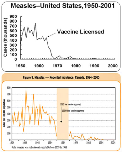 people dying even if the same number of people are still getting sick. Then Gorski takes on a graph of Canadian data that does use incidence rates, in this case showing that the incidence of measles in Canada dropped steadily between the 30s and the 60s, even before the measles vaccine was introduced:
I was immediately suspicious of this graph, though. The reason should be obvious; the decline in measles incidence is far too smooth. Measles incidence typically varies greatly from year to year. Fortunately, in his chutzpah, Obomsawin included a link to the actual source of the graph. Naturally, I couldn’t resist checking it out, and I found that the link leads to the Canadian Immunization Guide section on the measles vaccine. And this is the actual graph from which Obomsawin allegedly extracted his data [It’s the orange chart above. –ed.]
Note how Obomsawin left out a section of eight years when measles was not nationally reportable. Also note how he has, to be charitable, cherry picked the years to produce the impression of a smoothly declining measles incidence from 1935 to 1959. As I said, it doesn’t get much more intellectually dishonest than that.
OK. But this still provokes a question: Before 1950 measles incidence was about the same in Canada and the United States. (The charts use different measurements but they represent about the same incidence rate.) So why did measles incidence in Canada drop dramatically between 1950-1960 while it stayed steady in the U.S.? Did Canada do something else around 1950 to reduce measles exposure? Or what? Because it sure looks like something happened north of the border.


