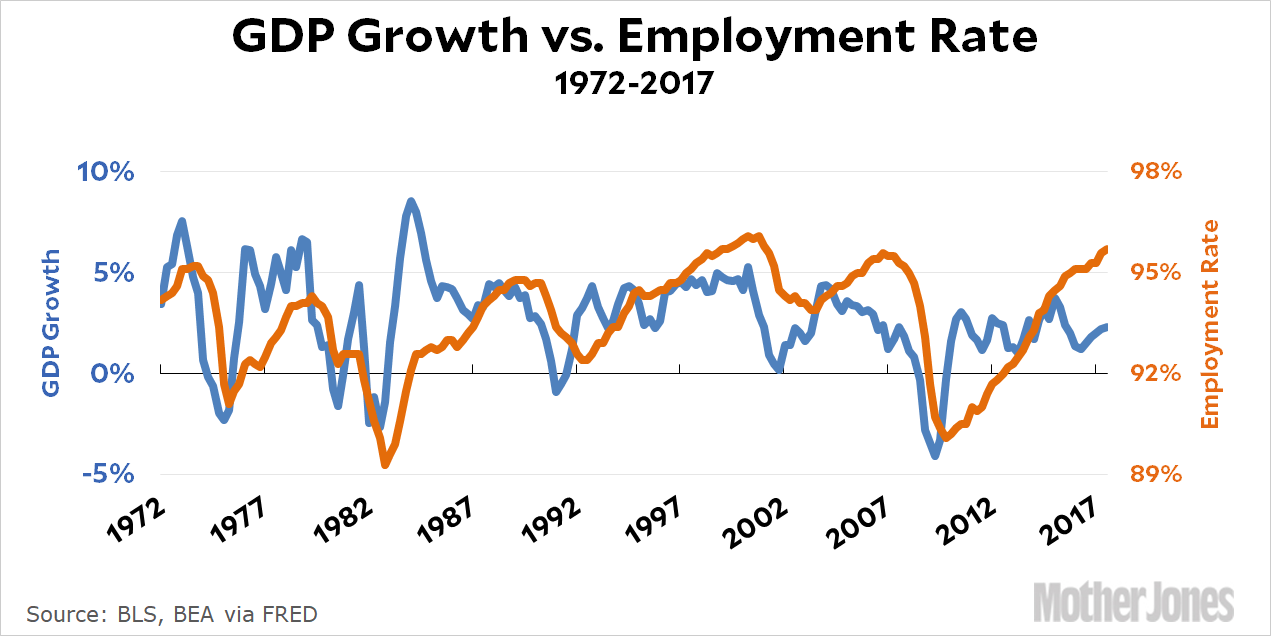
Dr. Drang doesn’t like my charts. Hmmph. But let’s keep an open mind and find out just how wrong he is:¹
- First, the choice of tick spacing and positioning makes no sense. If you’re making a political point, you should use four-year spacing aligned with presidential administrations. If you’re not going to use administrations, just label the decades and use tick marks between them. Five-year spacing on the twos and sevens is something clearly decided by software; it’s not how humans think.
- Second, there should be vertical gridlines. If precision in reading the data is important enough to add a horizontal grid, it’s important enough to add a vertical grid as well. I’ve been seeing a lot of graphs with half-assed grids lately, so I assume this is the default in some graphing software.
- Third—and I admit this is a personal peeve—there’s no point in tilting the x axis tick labels. It’s just an affectation. The years are tilted 30–35° from the horizontal, which means they take up over 80% of the space that untilted labels would. The savings isn’t worth it, and it draws attention away from the data.
Here’s the chart replotted using Dr. D’s preferences:
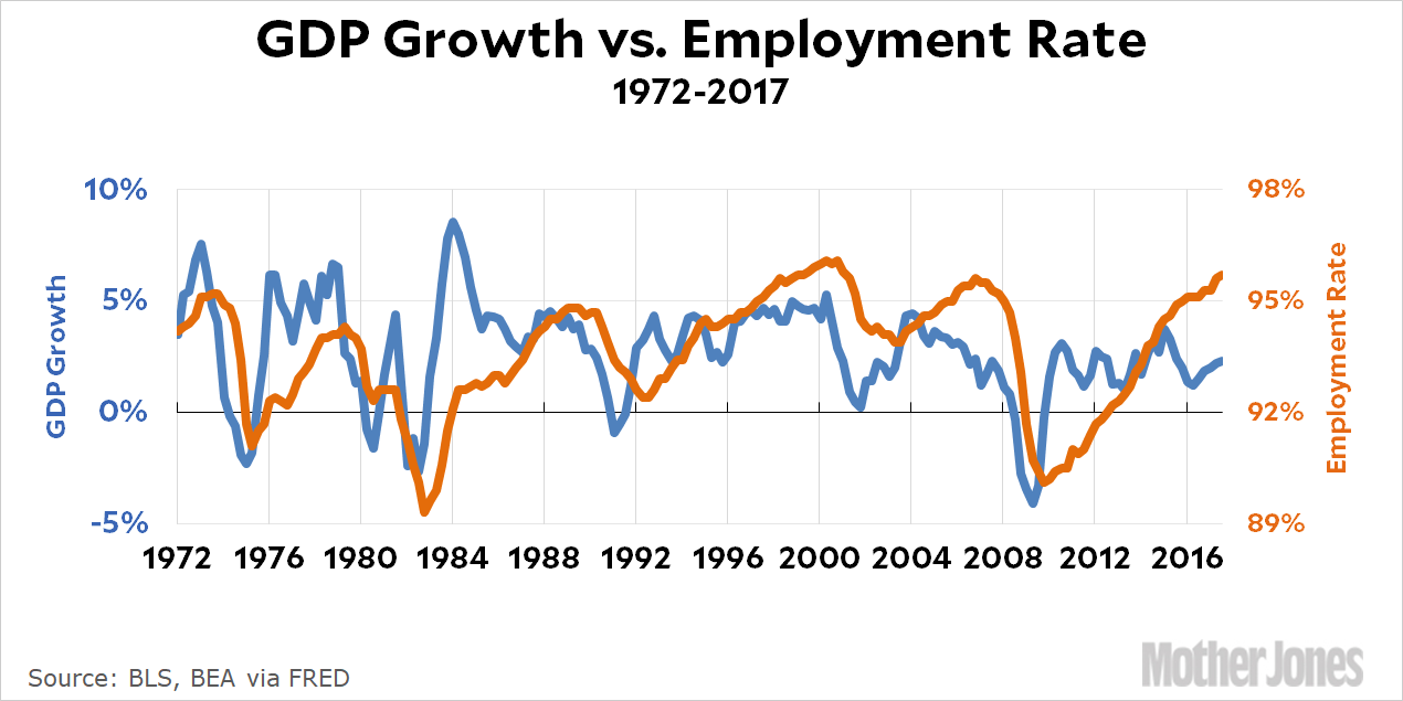
And here are my responses to his three points:
- I wasn’t making an explicitly political point in this chart, but yes, sometimes I use odd intervals. However, this is very much not a software default. I am constrained by the software to include the starting year, and what I normally try to do is pick intervals that allow me to show the final year as an endpoint. In this case, using 5-year intervals takes me from 1972 to 2017, which makes it absolutely clear that the chart ends at 2017.² Now, sometimes this means choosing odd intervals. Sometimes it means messing a bit with the start of the chart. And sometimes I just can’t do it because the starting point is important and the span from start to finish is a prime number. I hate when that happens.
- Vertical gridlines, eh? Maybe. Visually, I’m not a fan of vertical gridlines, but they do help help readers who actually want to look at the data carefully.
- I use tilted x-axis titles when straight titles won’t fit. The replotted chart above, for example, is hard to read with the numbers so close together. I could use a small font, of course, but I prefer not to since lots of people read this stuff on smartphones. If you watch carefully, you’ll see that I regularly use straight titles when I can. Usually, though, I prefer to show lots of year tickmarks (for the same reason Dr. D likes vertical gridlines), and that means tilting them to make them readable.
The rest of his post is about dual y-axes, and I’ll just say that I find it unconvincing. He basically suggests taking the chart above and making it into two charts, and then putting one right above the other. But that’s two charts, which is precisely what I’m trying to avoid.
So what is Dr. D’s real problem with dual y-axes? It’s the same as Kieran Healy’s: “The problem with this kind of plot is the freedom it gives the chartmaker to fiddle with the scales of the axes to make the items being plotted look more or less correlated.” It’s true that an explicitly dishonest chartmaker can take liberties with this stuff, but a dishonest chartmaker can do that with anything. Let’s worry instead about honest chartmakers. My response is simple: yes, you can stretch and shift the axes to make a correlation look better, but there’s nothing wrong with that. It just means you’re plotting a regression of the type y = ax + b, and that’s fine. Every regression involves constants. If you can make it work visually, you can make the algebra work too.
In any case, I think that charts like this are never meant to be anything more than suggestive. If you want to show a real correlation then you have to do the work to show a real correlation and then justify your belief that it means something. If you do, then a chart like this can be a nice visual illustration, but that’s all.
¹This is a joke.
²Is this worth it? I think so, because in a chart for a lay audience you really need to make everything explicit or else people will have questions. Did you include the most recent data? Is it adjusted for inflation? Etc. All of this needs to be as clear as possible in the chart itself, not just in the text.


