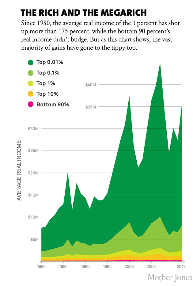
We’ll be posting a new chart on the current state of income inequality every day for the next couple of weeks. Yesterday’s chart looked at how the richest Americans bounced back from the Great Recession. Today’s chart: How the richest of the rich have enjoyed massive income gains for decades.
Since 1980, the average real income of the 1 percent has shot up more than 175 percent while the bottom 90 percent’s real income didn’t budge. But as this chart shows, the vast majority of gains have gone to the tippy-top—the 1 percent of the 1 percent.

Source: Emmanuel Saez and Thomas Piketty (Excel)
Illustrations and infographic design by Mattias Mackler?


